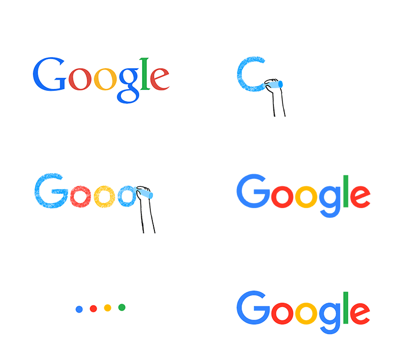
Since its inception as a search engine for the web, net users have seen Google evolve into more than just that. With Gmail, YouTube, Chrome, Maps, Android and many other services and devices, there’s no way you’ve never heard of it. Google has become an important piece of the Internet in so many ways. Today, as the company keeps growing and changing, so does its logo once more.
So, what’s new in this evolution? The old blue serif “g” icon is being replaced with a four-color “G” which matches the colors in the logo. The new Sans Serif font makes the logo look newer and colorful.
The Google post written by Tamar Yehoshua, Product Management & Bobby Nath, Director of User Experience, says: “This isn’t the first time we’ve changed our look and it probably won’t be the last, but we think today’s update is a great reflection of all the ways Google works for you across Search, Maps, Gmail, Chrome and many others. We think we’ve taken the best of Google (simple, uncluttered, colorful, friendly), and recast it not just for the Google of today, but for the Google of the future.”
The newest design is not yet available on all company products but Google will do them soon.


[Source]: Google – Official Blog: Google’s look, evolved & El look de Google evoluciona.


 Noticias NewsWire


